
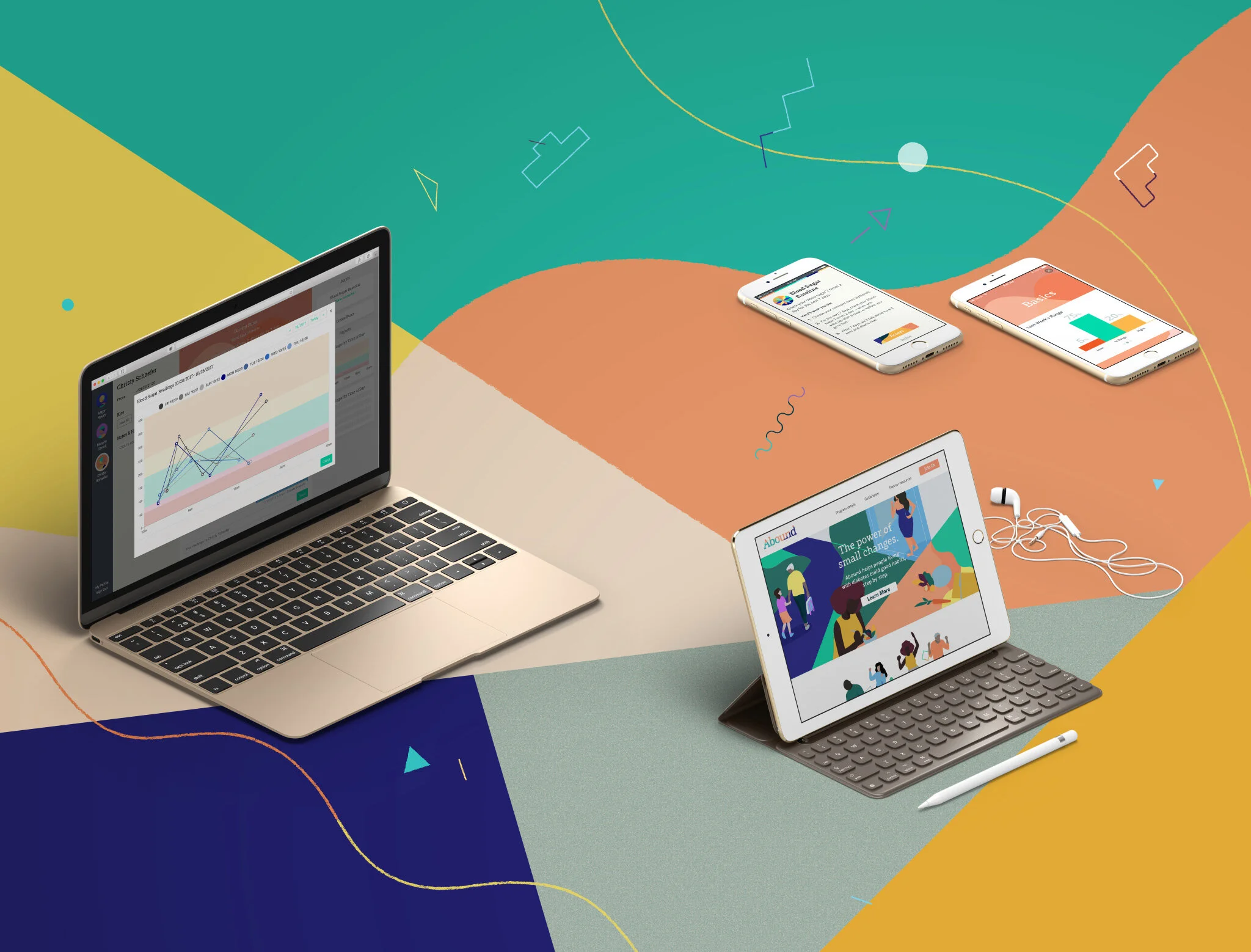


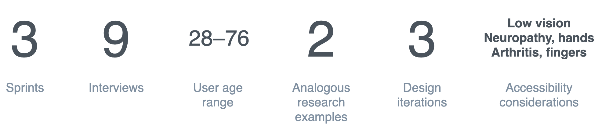


Piloting a digital health service designed for people living with diabetes
The team spun up a self-contained digital health service in order to design and learn from a medical pilot
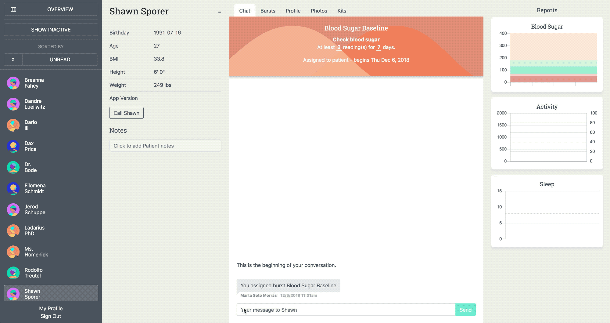
The core of the Abound service was the relationship between a member and a guide—a motivating healthcare practitioner with a background in diabetes education
Abound strove to deliver care and advice—nurturing change, one small step at a time—across five major content domains
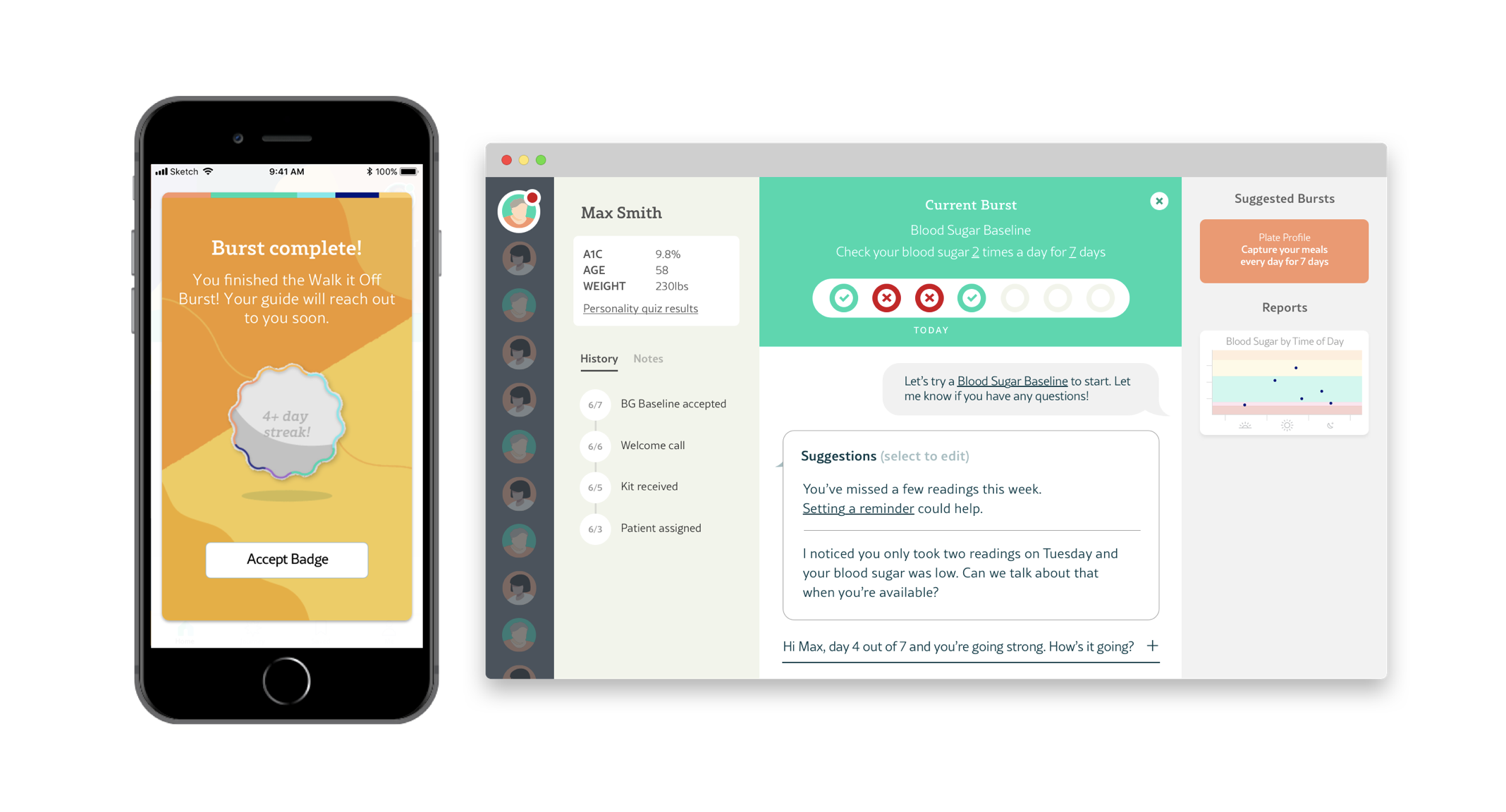
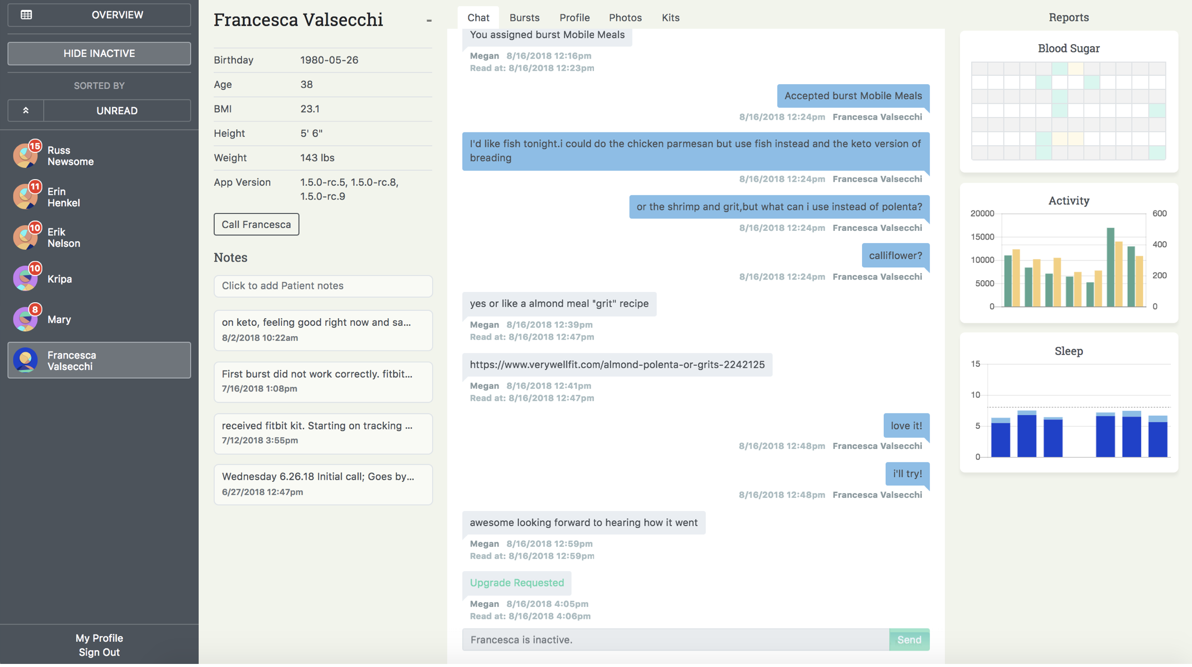
My role in this first phase of work centered on the tools we provided guides—our ambassadors and deliverers of the Abound service
Guide software was continuously iterated on through the medical pilot, and built with the benefit of constant, real-time feedback
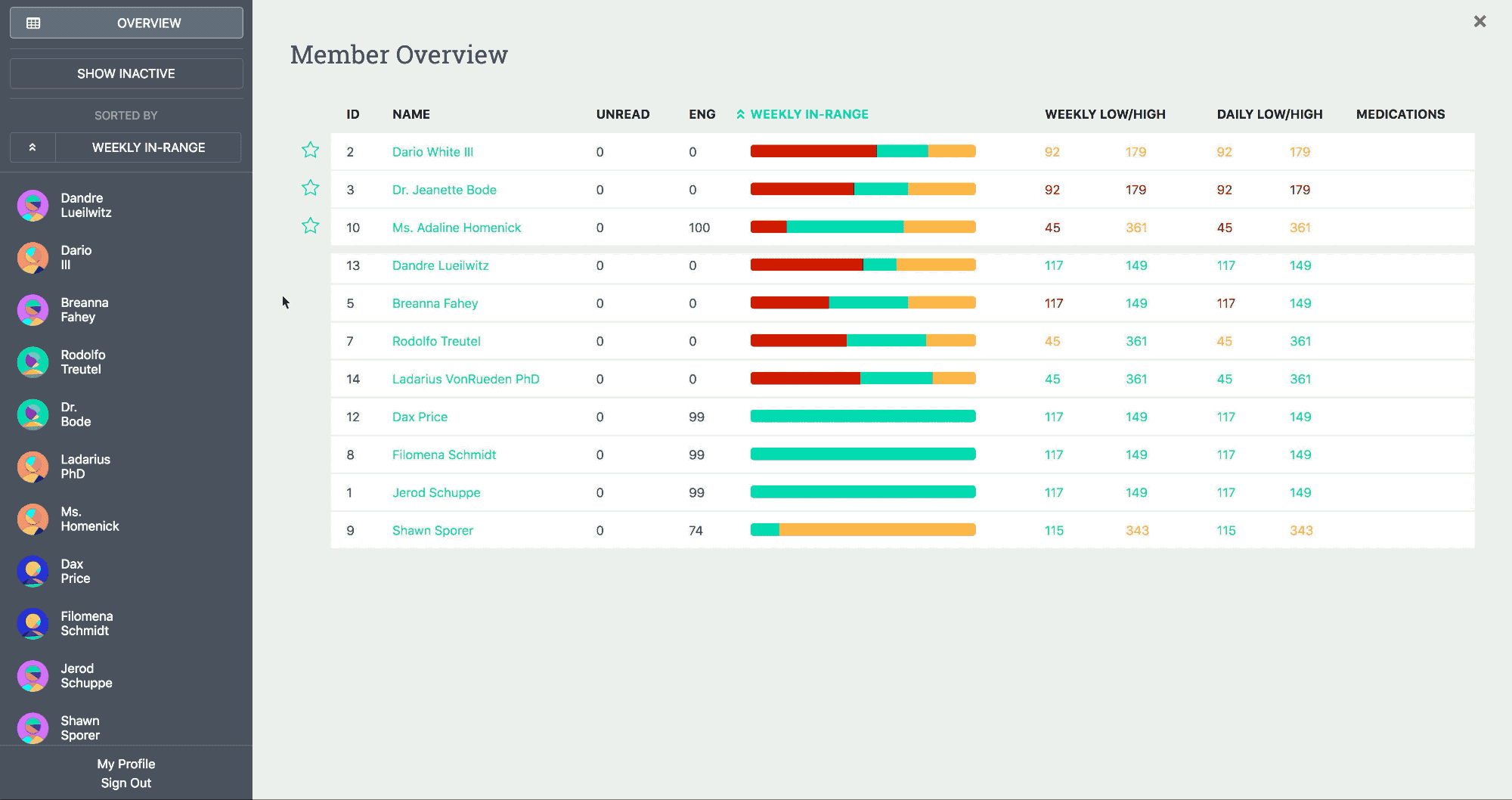
By the end of our pilot the guide software went from a chat channel to a full-featured app featuring, BG, activity, sleep data, and a means of reviewing the entire patient cohort
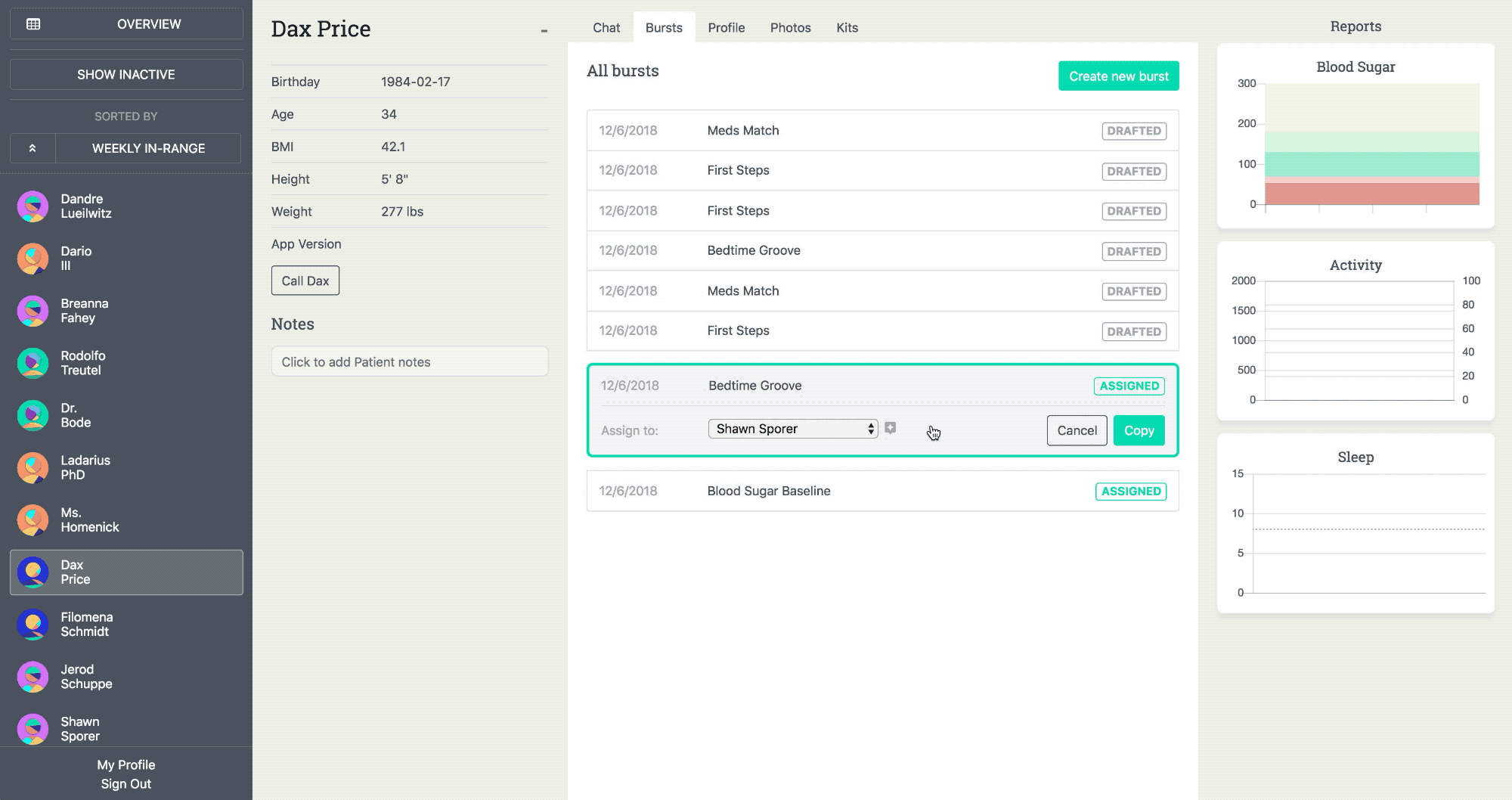
After the pilot, prototypes were created to demonstrate the power and potential of the next iteration of guide tools
We learned a great deal from our inaugural members—they taught us what the service needed and what it didn’t, while vividly demonstrating the power of small changes
Our usability pilot identified several areas of the Abound service that deserved attention—first among them: bluetooth meter syncing
For a variety of reasons Abound users required more time and customer support than expected to pair their blood glucose meters
The team embarked rapid series of sprints, each paired with a round of research in order to improve the pairing process
Each round of research centered around getting a user to make it through every critical stage gate without requiring customer service
We looked toward the world of digital toys and fitness accessories to discover critical syncing best practices
Preliminary research taught us many valuable principles to design against
The baseline design instructions were long, text-heavy, and failed to build a strong association between the meter and our app
Users were having a tough time making it to the app, weren’t making the connection that the meter connected to the Abound app, and the screens weren’t doing a sufficient job in helping users understand what they needed to do
Next, the team simplified the many pieces of the welcome kit into two clearly labeled sets—1 + 2—in order to introduce structure to the onboarding process
Despite key improvements to communication and package design, Abound was still failing to compete with the meter’s own instructions—which were misleading—but necessary due to FDA regulation
It became increasingly clear that our best chance to engage the user in a controlled setting would be getting them to open the app as soon in the process as possible
The final design incorporated a dual communication strategy: direct users to the app with a card on top of all kit contents as well as on a sleeve over the meter
The final approach suggested interventions across the app, package design, and meter hardware
Up next, the team began an open-ended search for the best ways to scale our newly established standard of care
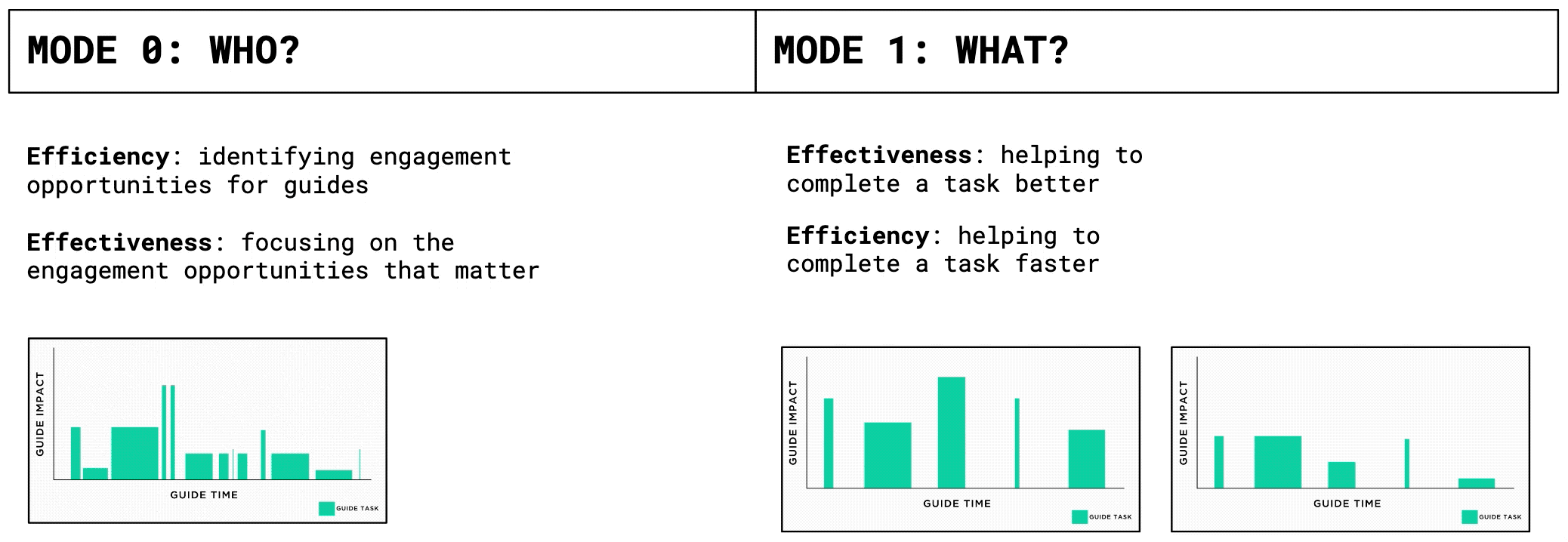
How might we augment the ability of our guides—making them more more efficient and effective—while staying true to the experience, brand, and values established in our pilot?
We spoke to a broad set of leaders whose job it is to seek out, cultivate, and manage human capital—at scale
Augmenting the human component of our service required seeing it through the eyes of those who delivered it—our guides
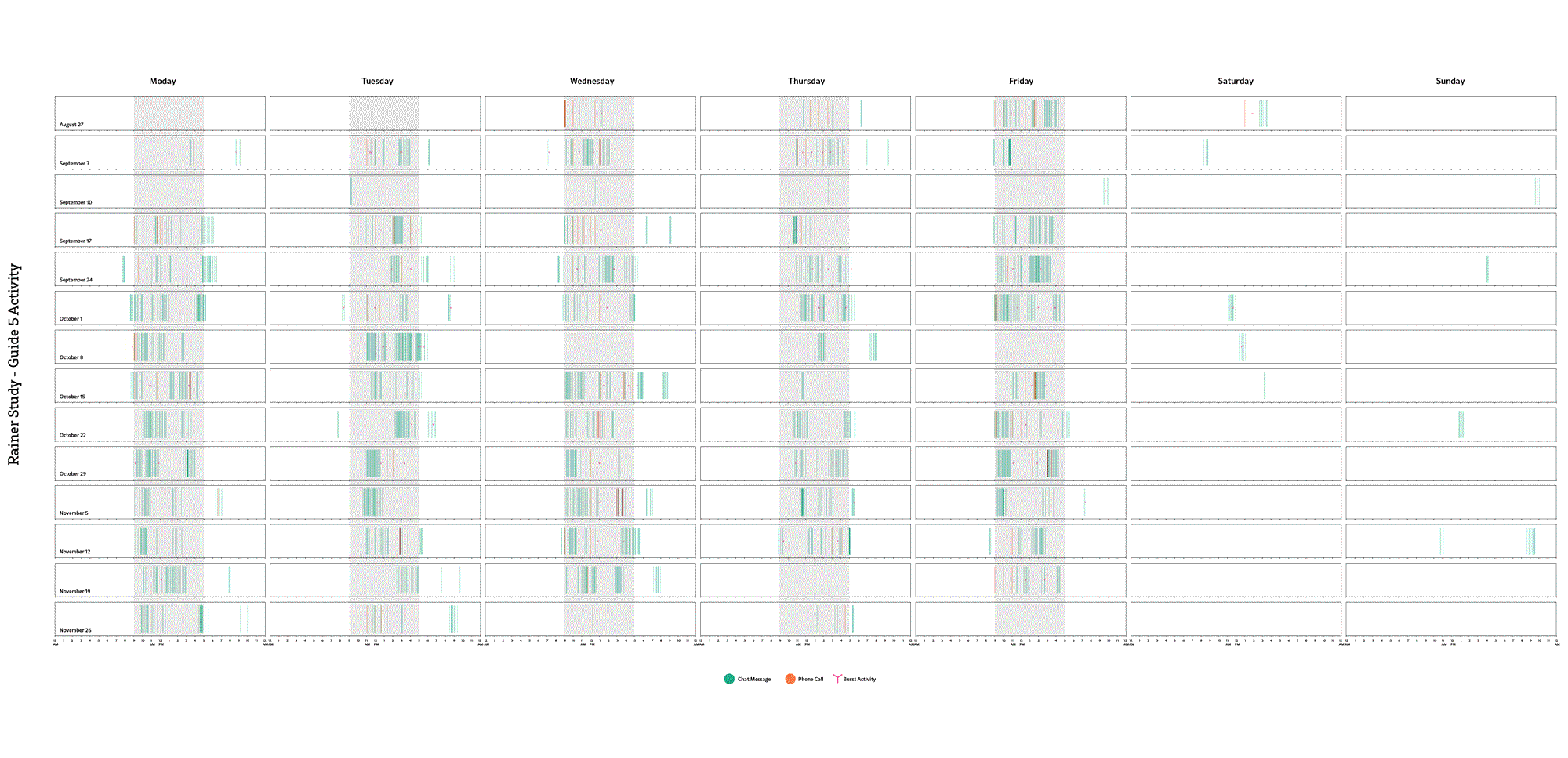
We immersed ourselves in a read out of what every guide and member was doing through our entire pilot
Deciding what to improve required analyzing all relevant user journeys and deciding where and when to act
As important to delivering a standard of care to a member, was deciding which member needed the support and attention in the first place—how are we ensuring that our quietest members don’t fall through the cracks?
Guide engaging with a member
Guide choosing a member to engage
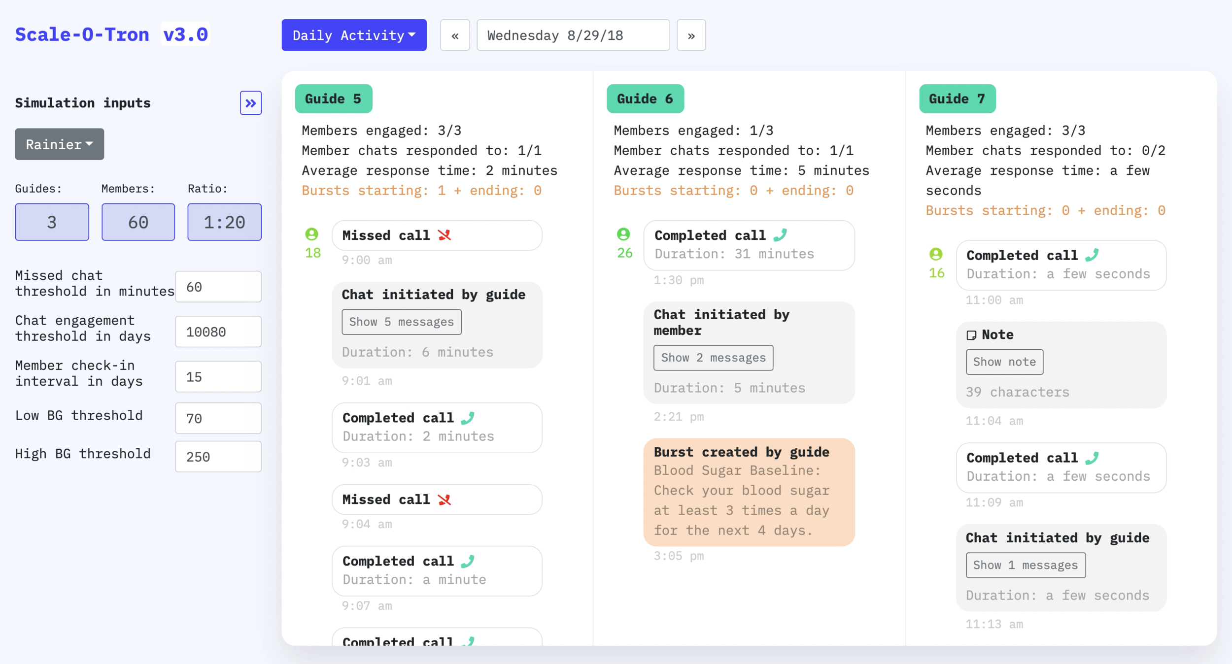
To get a sense for when and how members should be engaged, we build a tool to better understand how guides and members spent their day
This allowed us to reconstruct each day through the lens of a daily task list—and to research that feature using a guide’s own data
Refining the daily task list allowed us to build a scale-based simulation to explore the consequences of increasing the guide-to-patient ratio
The final deliverable of this project was to make detailed rollout recommendations and deliver a now, near, and far product roadmap
Plotting all of the teams ideas against an impact vs effort 2x2 paved the way to a detailed now-near-far plan with clear priorities and dependencies illustrated
Team:
Abound
Erin Henkel, Guide
Jon Wettersten, Guide
Toi Valentine, Co-Project Lead
Ben Syverson, Co-Project Lead
Sam Becker, Software Design
Many, many other designers including, but not limited to: Fra Valsecchi, Jarrod Ryhal, Ross Weijer, Gabriel Mitchell, Marta Soto Moras
Meter Pairing
Sam Becker, Project Lead
Fra Valsecchi, Data Science
Rob Rehrig, Interaction Design
Houston
Michael Moliterno, Project Lead
Sam Becker, Software Design
James Zhou, Interaction Design
Zahin Ali, Interaction Design