


Bringing the Time Warner Cable experience to life in ways that are simple and easy.
Put customers at the center of everything Time Warner Cable does. Remove all of the clutter and confusion that had been building up and diluting the equity of a once-iconic brand.
Remove all of the logos, type treatments, patterns and illustrations that didn't directly latter up to the iconic Eye & Ear symbol—require that every single touch point live up to the company's mission statement.
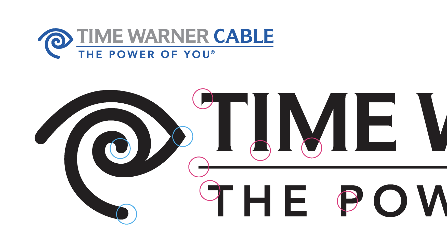
The Eye & Eye is an iconic symbol with roots in the Bauhaus.
The symbol was redrawn with utmost care and deliberate connection to a new typographic system.
For the first time, utilizing typography based on the DNA of the symbol.
This led to tangible improvements across the customer experience—from billing statements to the cable box interface.
A relentless focus on a core set of design elements allowed for renewed sense of vitality and flexibility in the iconic symbol—now seen in more places, more often.
Team:
Wally Krantz, Executive Creative Director
Sam Becker, Design Director
Isabel Babcock, Senior Designer
Carrie Ruby, Senior Designer
Dana Killinger, Senior Designer